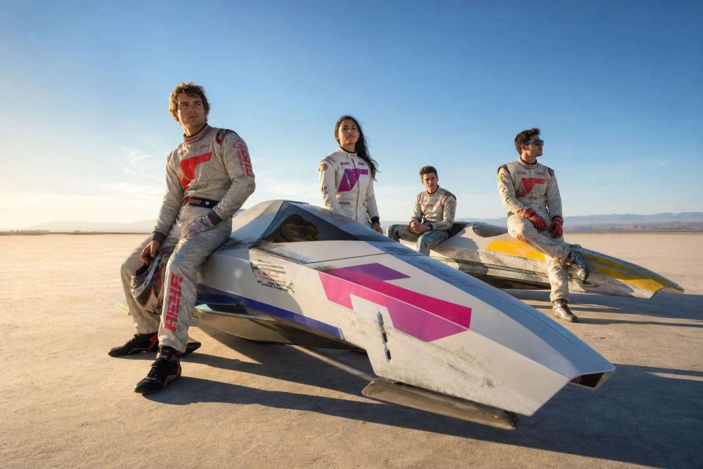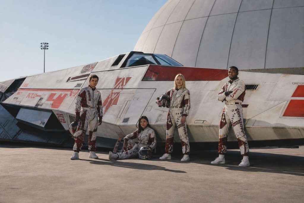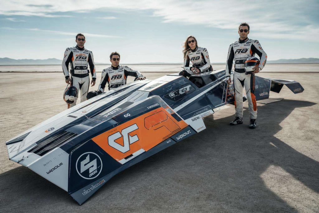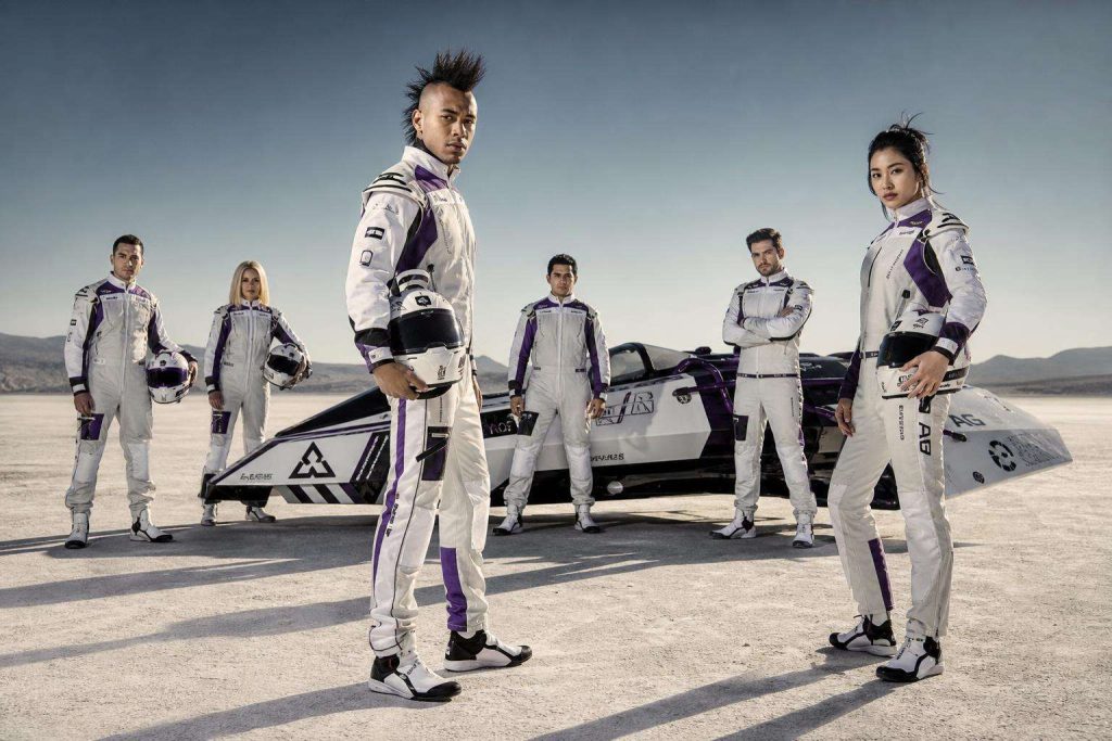


The Branding Tricks Behind WipEout’s Racing Teams
Focused keyphrase: The Branding Tricks Behind WipEout’s Racing Teams
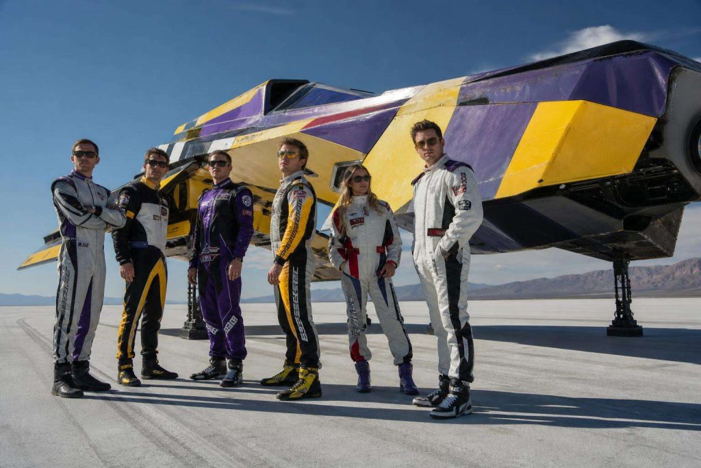
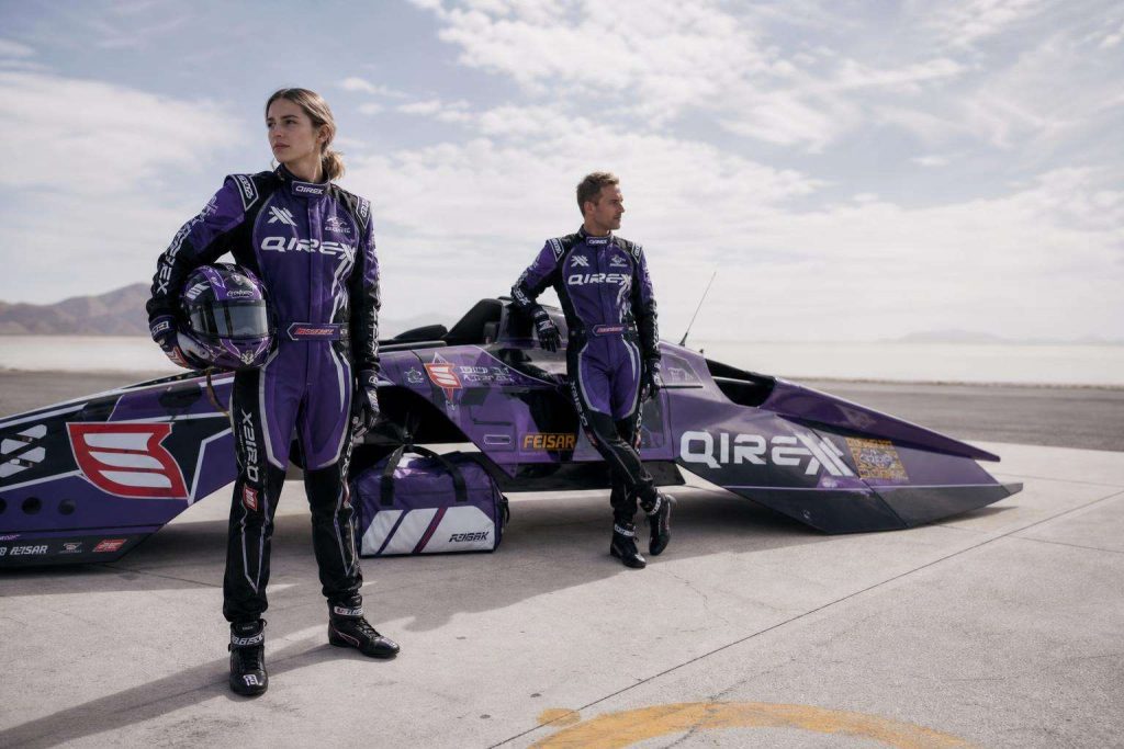
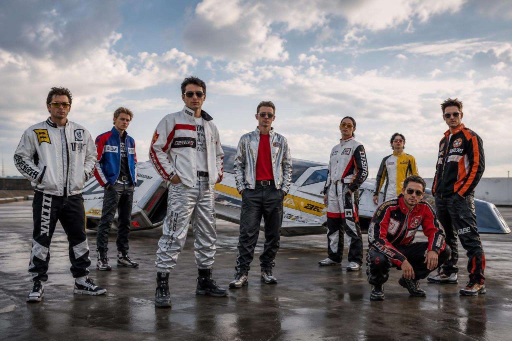
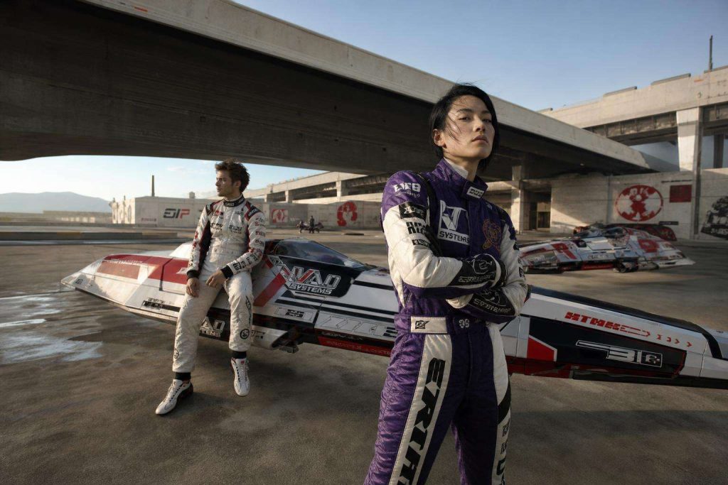
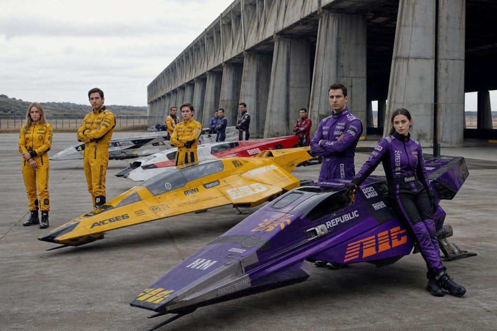
What makes a fictional racing team feel more real, more desirable, and more memorable than many brands competing in the real world? That is the question at the heart of The Branding Tricks Behind WipEout’s Racing Teams. Long before modern design Twitter threads, brand strategy podcasts, and “world-building” became marketing buzzwords, WipEout was already showing how visual identity, typography, color systems, team mythology, and cultural positioning could create fierce loyalty.
For designers, strategists, founders, and ambitious marketing teams, WipEout is more than a PlayStation-era anti-gravity racing game. It is a masterclass in brand differentiation, visual storytelling, future-facing design, and emotional brand recall. Its racing teams were not just skins on vehicles. They were complete brands with attitudes, values, tribes, and design languages. In a crowded entertainment landscape, each team stood for something distinct. That is exactly what the strongest businesses do.
If your brand looks acceptable but feels forgettable, there is a lesson here. If your business wants to stand apart in a market filled with polished sameness, there is a lesson here. And if you have ever wondered how design can make people feel allegiance before they even buy, there is a lesson here too.
Why WipEout Still Matters to Branding Experts
WipEout arrived at a time when video games were also becoming cultural artifacts. The original game’s visual identity was famously shaped in part through the involvement of The Designers Republic, the influential Sheffield design studio known for its sharp, futuristic, anti-corporate graphic language. Their work helped create a world that felt like it existed beyond the game screen. You can explore background on the franchise and its design legacy through resources such as the WipEout series overview and discussions of The Designers Republic.
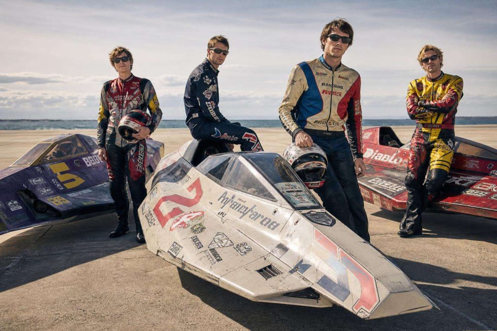
What made this so powerful? The teams did not simply say “fast.” They each said a different kind of fast. One felt militaristic. Another felt elegant. Another felt anarchic. Another felt technologically pure. This is where most businesses go wrong. They communicate the category, but not the difference. They say “premium,” “innovative,” or “customer-focused” the way everyone else does, and then wonder why attention does not convert into affection.
Brand positioning is not just what you do. It is the emotional and visual territory you can own in the audience’s mind. WipEout understood that instinctively.
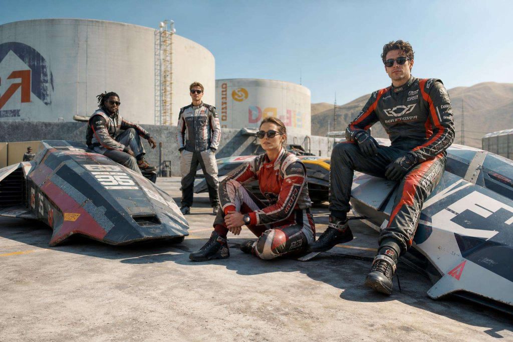
It turned teams into tribes
Fans did not just choose a vehicle based on stats. They chose a team that reflected something about themselves. That is one of the strongest outcomes in branding: not preference, but identification. When people say, “That feels like me,” you move beyond transactions and start building community.
It made design part of the experience
In weaker brands, design decorates the offer. In stronger brands, design is the offer. WipEout’s graphic systems were not an afterthought. They shaped perception, mood, and desire before gameplay even began.
It connected to a wider culture
WipEout was intertwined with music, club culture, fashion-adjacent aesthetics, and futuristic graphic experimentation. The game felt plugged into something bigger than itself. Great brands do this too: they do not float in isolation. They participate in culture, and in doing so, they gain relevance.
“The best brands don’t just sell a product. They create a world people want to belong to.”
— A truth every strategist can learn from WipEout’s enduring appeal
The Core Branding Tricks Behind WipEout’s Racing Teams
1. Every team had a sharply defined personality
One of the most powerful branding tricks in WipEout was clarity. Each team projected a specific character. This is fundamental to brand strategy. If your audience cannot describe your brand’s personality in a sentence or two, your positioning is too weak or too vague.
Teams in WipEout often suggested values like aggression, technical precision, elegance, rebellion, endurance, or elite engineering. These cues shaped expectations. They created meaning before performance was even experienced.
Ask yourself: can your audience tell the difference between your brand and your competitors without seeing your logo? Or are you all speaking with the same polished voice using the same safe visual systems?
2. Visual identity was consistent, not random
The ships, insignias, color palettes, typography, interface graphics, and environmental touches all worked together. This is what many companies miss. They invest in a logo, perhaps even a website redesign, but neglect the wider identity system. The result is inconsistency. And inconsistency weakens trust.
WipEout’s best team branding showed that memorable identity comes from repeated visual patterns. Distinctive design systems are what make brands easy to recognize at speed, across channels, and over time.
For evidence of how strong visual consistency improves recognition, Nielsen Norman Group and other usability leaders repeatedly highlight the value of consistency in building user trust and lowering friction; see this broader discussion on consistency and standards.
3. The teams felt like they came from real institutions
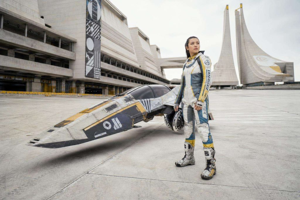
Another subtle trick was plausibility. The teams felt embedded in a believable future. Their naming, symbols, sponsor-like cues, and technical visual language suggested organizations with histories, politics, resources, and ambition. This is where fictional branding became world-class brand design.
Real brands can apply exactly the same principle. People trust what feels coherent. Does your business look like it has depth? Does it feel established in its own logic? Or does it feel like a collection of marketing materials made separately by different people at different times?
4. They used contrast to create desire
Some teams looked severe. Others looked sleek. Some radiated danger. Others hinted at discipline or intelligence. These differences matter. Contrast is the engine of preference. If everyone in your sector looks calm, perhaps you should feel bold. If everyone feels technical, perhaps you should become human. If everyone is shouting, perhaps you should become precise.
WipEout’s teams did not fight for identity by becoming louder versions of the same thing. They created different emotional entry points. That is how real brands win crowded markets too.
What Modern Brands Can Learn from Specific Team Branding Logic
Even without naming every team configuration across the series, we can break down the strategic logic that made them compelling and turn that into practical branding guidance.
| Branding device | How WipEout used it | What your business can do |
|---|---|---|
| Color ownership | Teams leaned into strong, repeatable palettes | Build a color system your audience can recognize instantly |
| Typography | Letterforms reinforced futuristic, elite, or aggressive cues | Choose type that reflects your positioning, not just readability alone |
| Narrative depth | Teams implied history, rivalry, and institutional context | Give your brand a story that explains why it exists and what it stands against |
| Audience alignment | Players picked teams that matched identity and aspiration | Design for the customer your brand wants to attract, not everyone |
| Cultural signals | The entire world referenced music, design, and future culture | Anchor your brand in the conversations and aesthetics your audience already values |
Color was never just decoration
In branding, color creates immediate category cues and emotional shortcuts. WipEout’s teams used palette with intention. If your current brand colors could be swapped with a competitor’s and no one would notice, your system is too generic.
Typography did strategic work
Type in WipEout often carried its own message: engineered, coded, aggressive, sleek, industrial, or clean. For modern brands, this is a reminder that typography is not neutral. It can increase perceived authority, innovation, warmth, or exclusivity.
Symbols created faster recognition than words alone
Team insignias and iconic marks allowed quick recognition at racing speed. Businesses should take note. In digital environments where attention is fragmented, your brand assets need to communicate almost instantly.
The Emotional Genius of Team Allegiance
One of the most brilliant aspects of WipEout branding is that it encouraged emotional allegiance through aesthetics and identity before proving itself through performance. This is extraordinarily relevant to modern marketing.
Consumers rarely buy based on logic alone. Research from institutions like Harvard Business Review has long explored how emotion drives customer behavior. People justify with logic, but they are often moved by emotion, identity, and perceived meaning first.
People choose what reflects who they want to be
A player did not just select speed stats. They selected a feeling. Was it command? Precision? Defiance? Prestige? Future cool? Great brands know that buying decisions often carry this same symbolic weight.
Your customer is not merely asking, “What does this do?” They are asking, often silently, “What does choosing this say about me?”
Aspirational branding works when it stays believable
WipEout’s teams were aspirational, but not vague. They felt elevated while still distinct and grounded within the game world. For brands, this is critical. Aspiration should never drift into bland luxury clichés. It should feel precise, earned, and tailored.
“People don’t become loyal to average. They become loyal to identities that help them express who they are.”
— A principle as true in branding as it is in WipEout fandom
How This Applies to Your Brand Right Now
Here is the uncomfortable truth: many businesses have good intentions, decent products, and capable teams, but their branding lacks friction, magnetism, and memorability. It says enough to be accepted, not enough to be chosen. WipEout’s racing teams offer a different model.
Define your internal rivalries and tensions
The strongest WipEout teams felt alive because they existed in a competitive ecosystem. Likewise, your brand should know what it stands for and what it stands against. Are you fighting complexity? Disposable quality? Bland corporate sameness? Slow service? Outdated industry thinking?
Build a brand system, not a logo file
Award-winning branding is systematic. It includes visual language, copy principles, hierarchy, motion, message framing, user experience tone, and environmental cues. If your identity breaks apart outside a pitch deck or homepage, it is not a complete system.
Create preference before the sales conversation
The best branding shortens the distance between awareness and desire. It makes the right customer feel, “This is for me” before your team even gets on a call. That is not a cosmetic outcome. That is a serious commercial advantage.
Make every touchpoint feel part of the same future
WipEout’s world felt unified. Does your brand feel unified across socials, web, email, packaging, documents, and presentations? Or does it shift tone and visual style every time a new asset appears? Cohesion is persuasive.
Why Brandlab Is the Smart Next Move
If reading The Branding Tricks Behind WipEout’s Racing Teams has sparked something, that is not accidental. You can feel what strong branding does. It creates desire, clarity, and confidence. It shows what is possible when identity is treated as a growth tool rather than a finishing touch.
Brandlab can help translate that level of distinctiveness into a real-world strategy for your business. Not borrowed style. Not trend-chasing. Not another identity that looks polished but says very little. A sharper brand position. A stronger visual system. A clearer message. A more ownable presence.
If your brand is blending in, under-signalling its value, or failing to create instant recognition, the opportunity cost is real. The right strategy can change how people see you, remember you, and choose you.
What Brandlab can unlock
Imagine your audience recognizing your brand from color, shape, tone, and message before seeing your name. Imagine customers understanding exactly why you are different. Imagine your team finally having a brand system robust enough to scale. Imagine your business looking as ambitious as it actually is.
That is what strong branding can do.
Ask the harder question
Not “Do we need branding?”
Ask instead: Can we afford to keep showing up with a brand that does not fully express our value?
Can you afford to let competitors claim visual territory you could own? Can you afford to keep relying on explanation when identity should be doing part of the selling? Can you afford to stay forgettable in a market where memory drives growth?
The Bigger Lesson from WipEout
The enduring genius of WipEout’s racing teams is not nostalgia. It is strategic clarity. The teams proved that people respond deeply to brands that feel specific, intentional, and alive. They showed that visual identity is not fluff. It is architecture for meaning. They showed that audiences do not just want function. They want affiliation. They want clarity. They want symbols they can believe in.
And that is the real story behind The Branding Tricks Behind WipEout’s Racing Teams. The game did not merely create racers. It created branded belief systems. It gave people options that felt emotionally legible and aesthetically irresistible. That is why it still matters, and why designers and strategists continue to reference it.
If your brand could be more distinctive, more cultural, more aligned, more premium, or more unforgettable, now is the moment to act. Why not get the solution? Why not create a brand people choose before you even make the pitch?
Contact Brandlab and build something people do not just notice, but remember, prefer, and want to belong to.
Sources and Further Reading
- WipEout video game series overview
- The Designers Republic
- Nielsen Norman Group: Consistency and Standards
- Harvard Business Review: The New Science of Customer Emotions
172556