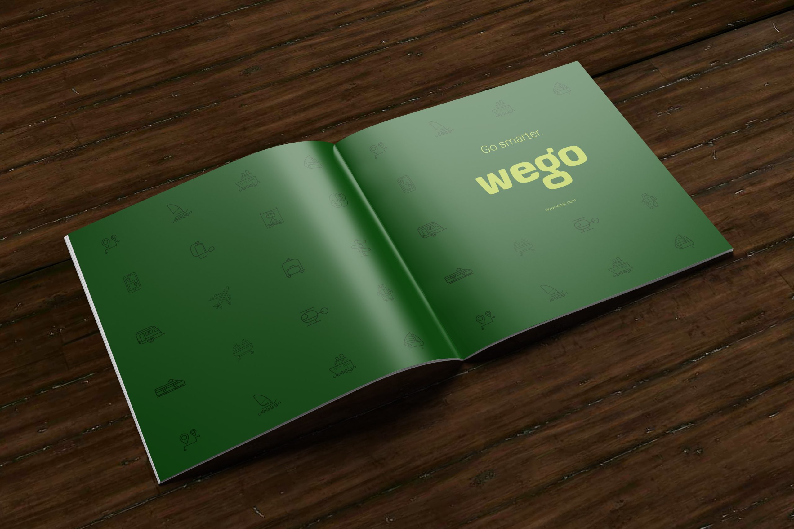
Although we were not responsible for the original WEGO branding or the creation of their initial corporate identity guidelines, our team was brought in to modernize their brand image and ensure it aligned with today’s market expectations. Our goal was to make strategic updates to their corporate identity guidelines, making the brand more adaptable and consistent across all applications.
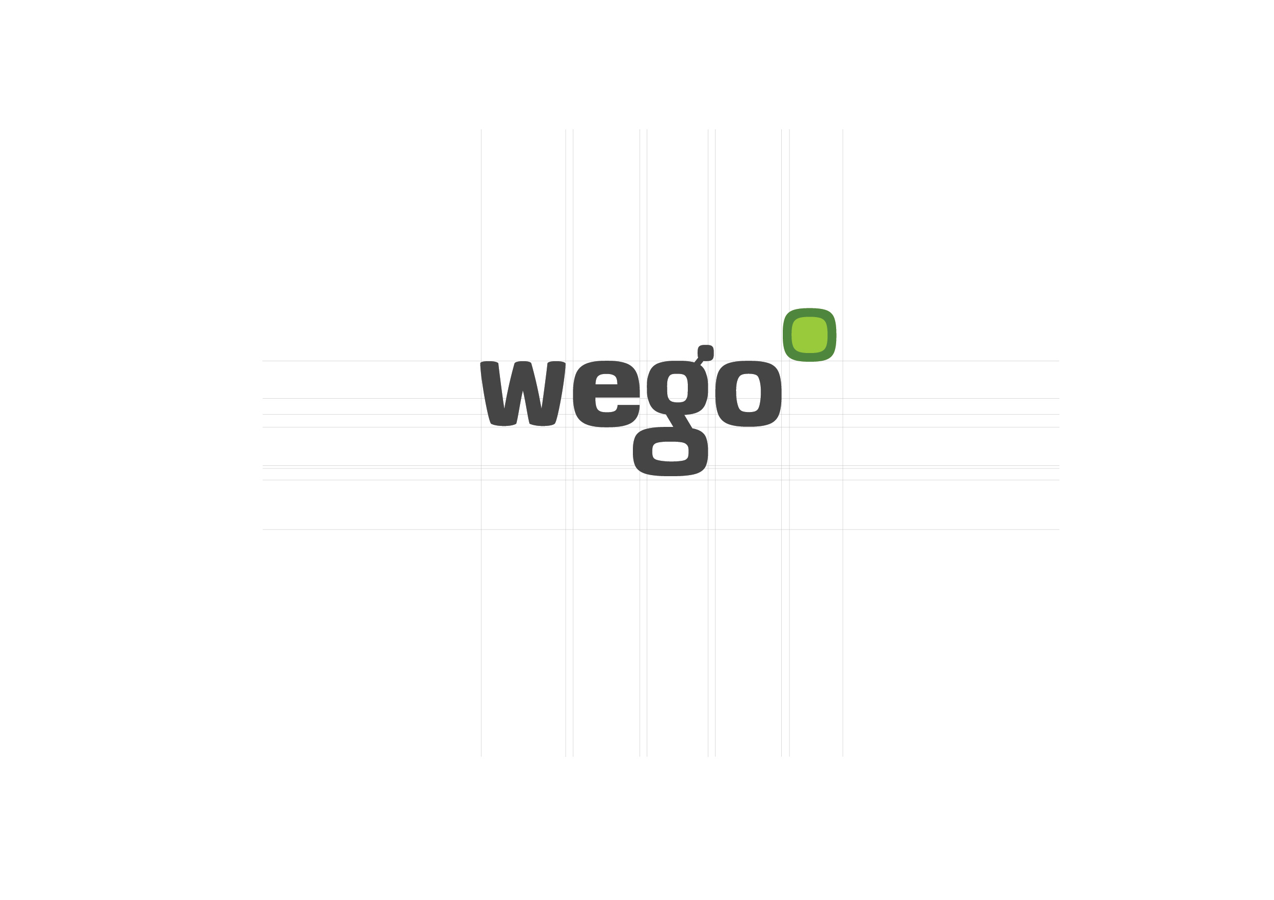
The primary objective was to create an updated corporate identity and a new brand wordmark, accompanied by a comprehensive guidelines document. This document was intended to be used internally across the organization’s various operations to ensure that the brand was consistently managed and reproduced, regardless of who was implementing it.
One of the main improvements involved updating the corporate logo to incorporate the new tagline, “Do Better”, which had become a core element of their brand message. This tagline needed to be seamlessly integrated into all brand touchpoints while maintaining the essence of the original design.
In addition to the logo update, we focused on refining other key areas of their branding, ensuring that their corporate identity guidelines were tightened for better consistency. This process involved:
Consistency: We revised the corporate identity guidelines to ensure a uniform application of logos, typography, and color schemes across all media.
Brand Management: We conducted a thorough assessment of their brand from a management perspective, identifying areas where the brand could be more consistently and effectively applied.
Third-Party Usability: We provided comprehensive file formats and specifications to allow third-party design and print providers to implement the brand guidelines seamlessly. These files were prepared in multiple formats, ensuring smooth application across different media and platforms.
Our deliverables included a new corporate identity package with the following elements:
A refined brand wordmark that incorporated the “Do Better” tagline.
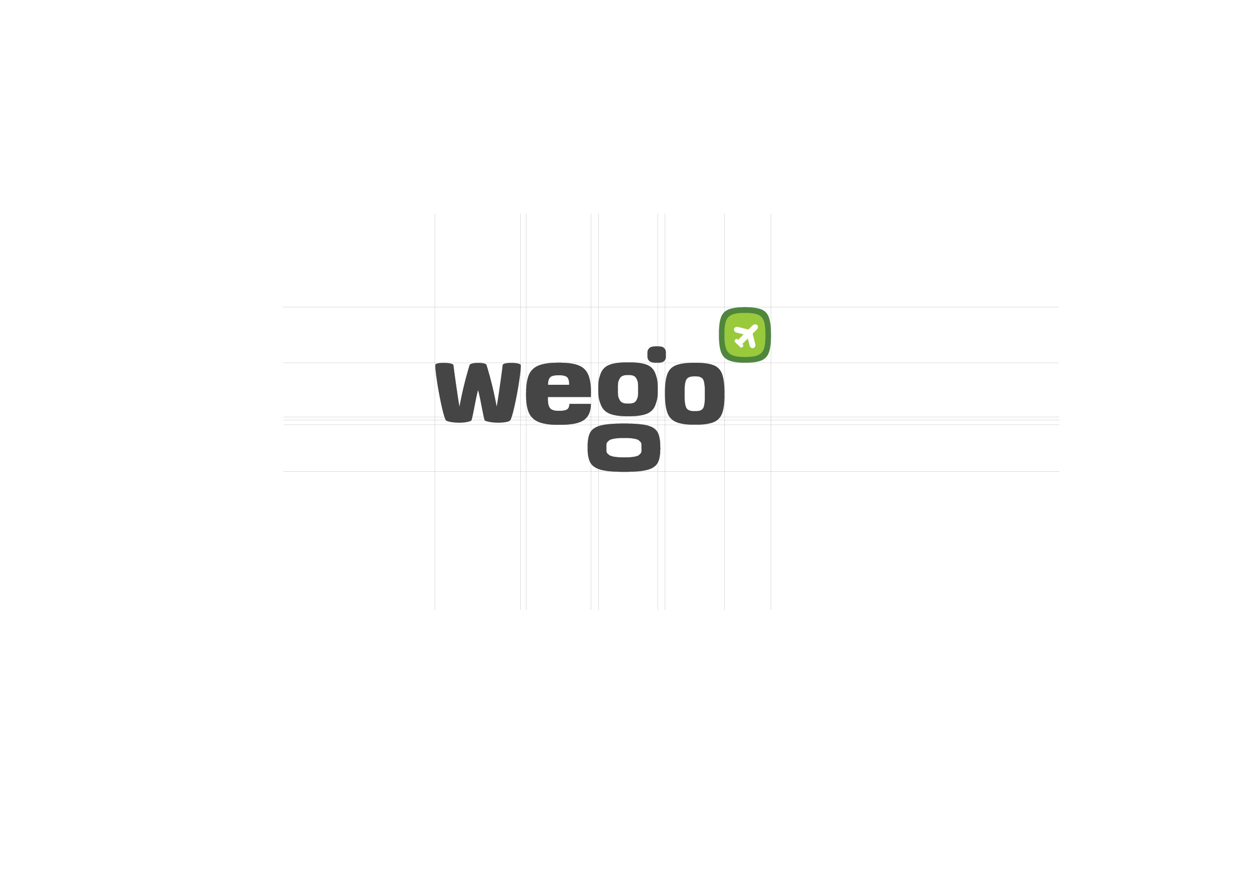
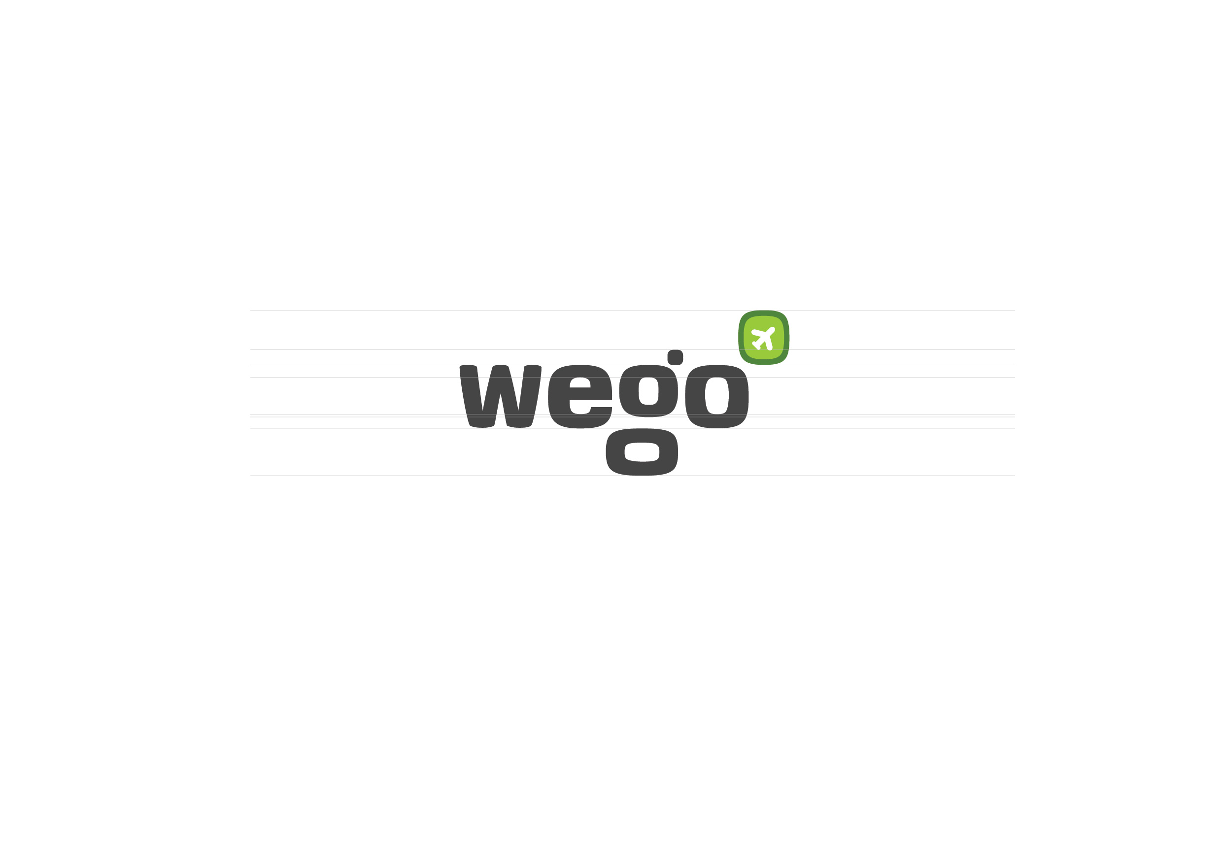
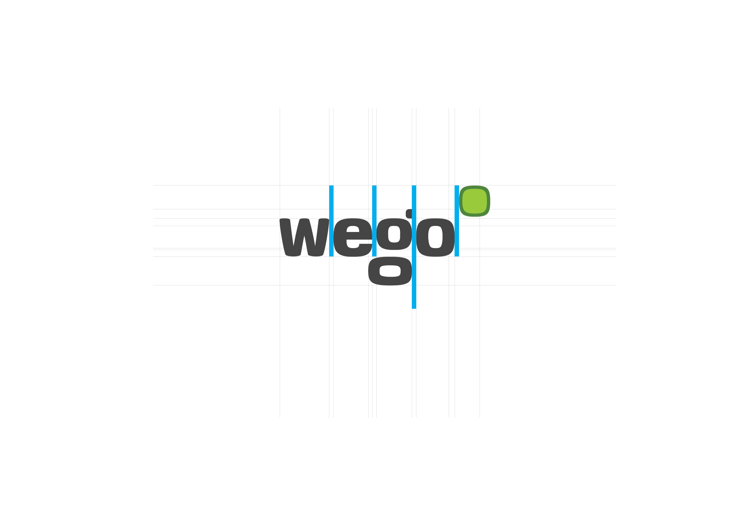
A detailed corporate identity guidelines document covering typography, logo usage, color schemes, and brand tone to ensure consistency.
Ready-to-use files for third-party designers, including print, digital, and web-ready formats to enable easy implementation of the updated branding across various channels.
Through our collaboration, WEGO gained a more cohesive and modern brand identity that resonated with today’s audiences. The updated corporate identity guidelines empowered them to manage their brand more effectively, while the comprehensive file supply allowed external partners to easily reproduce the brand with precision and consistency.
This project successfully enhanced WEGO’s brand image and ensured that their messaging was aligned across all platforms, providing a solid foundation for future growth.
