Russian Standard Vodka
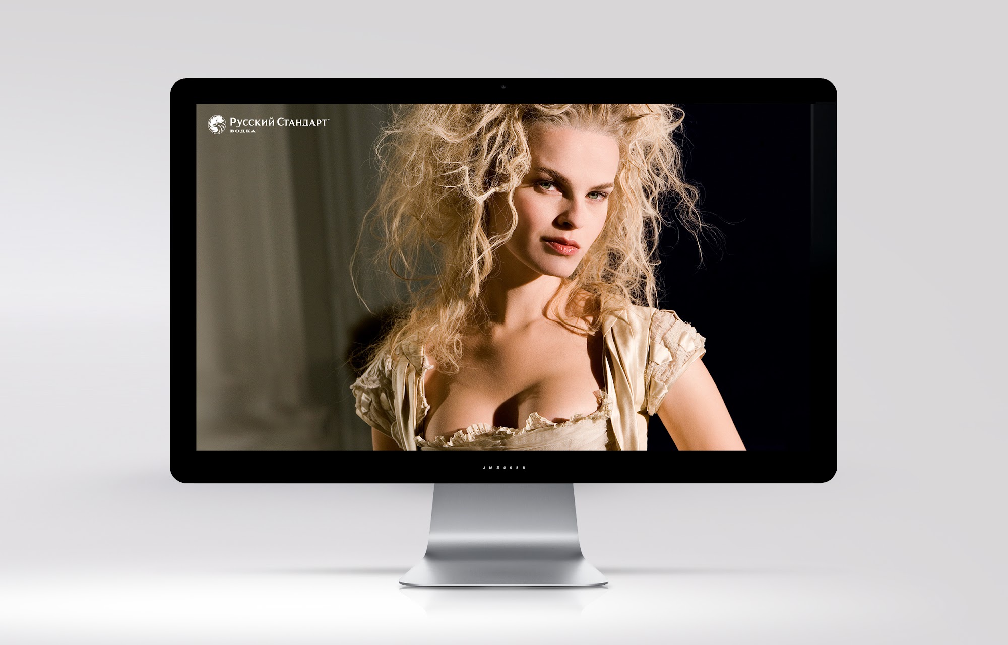
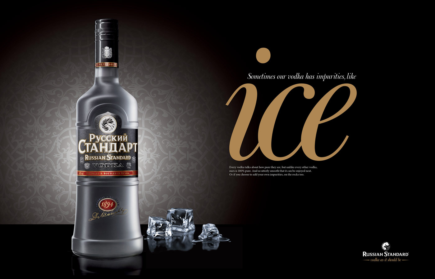
Premium brand creative, identity expression and visual storytelling for Russian Standard Vodka, showcasing fifteen archived artworks.
Inside the project
Russian Standard Vodka — a distinctive premium brand experience
Great branding does more than make a product look attractive. It gives people a reason to notice, understand and remember it. The Russian Standard Vodka portfolio is an example of how BRANDLAB approaches creative work with a clear sense of identity, consistency and visual impact. Working within the recognisable character of an established spirits brand, the challenge was to present its distinctive qualities through confident creative thinking and a carefully considered visual language.
Our starting point was the brand itself. Russian Standard has an unmistakable name and a strong association with heritage, provenance and a premium positioning. Rather than allowing that established identity to become a constraint, BRANDLAB treated it as a creative foundation. Strong brand work respects what audiences already recognise while discovering new ways to bring that recognition to life. It calls for a balance between bold expression and disciplined execution, so every design decision feels intentional.
Creative direction with purpose
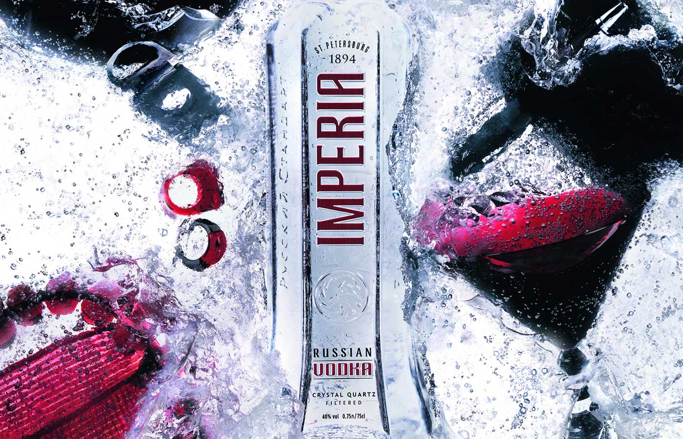
The visual work in this archive shows the value of developing an idea as a connected body of creative rather than as isolated pieces. A successful portfolio presentation should reveal how a brand can remain recognisable through different compositions and applications. That requires attention to hierarchy, proportion, typography, imagery, contrast and the relationship between individual elements. The result is not simply a collection of graphics; it is a coherent expression of a brand personality.
BRANDLAB's strength lies in connecting commercial understanding with design craft. When a product operates in a competitive category, instant recognition matters. A distinctive visual system can communicate confidence before a viewer reads a word. By concentrating on the essential elements of the identity, the creative presentation aims to give Russian Standard a memorable presence without overwhelming the core product story. Restraint is just as important as energy: knowing what to leave out can make the remaining detail work much harder.
A portfolio built to show the work
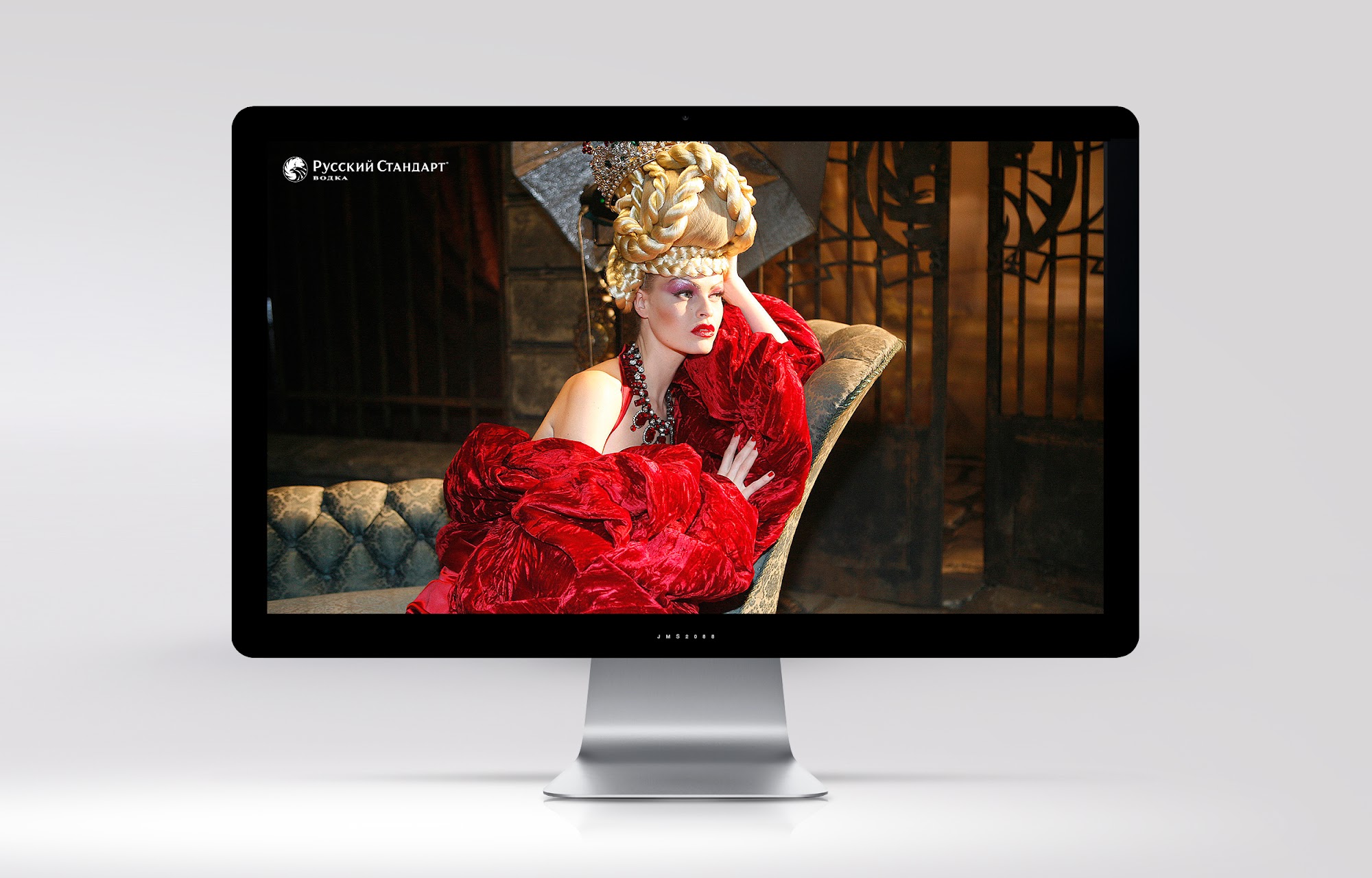
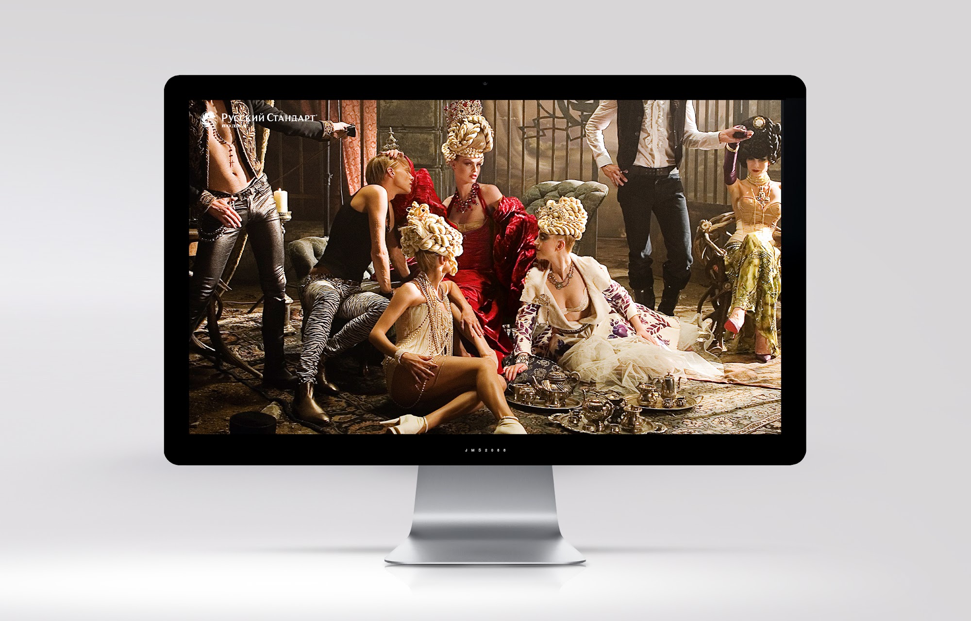
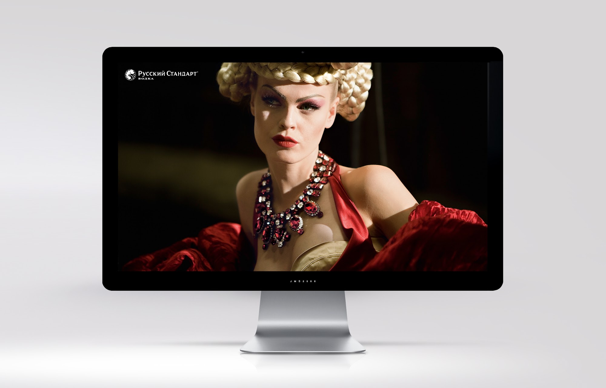
This project gallery brings together fifteen archived images, including five numbered RSV files and ten additional high-resolution visuals. Presented in sequence, they offer a broader view of the creative exploration and make it easier to appreciate the thinking behind the work. The images are the evidence of the design approach, so the page deliberately gives them room to lead. A clean, generously spaced layout allows each piece to be viewed on its own while also contributing to the larger story.
What makes this a compelling BRANDLAB case study is the commitment to quality across the whole experience. The emphasis is on clear art direction, dependable brand recognition and a polished presentation that lets the creative speak for itself. It demonstrates how thoughtful design can turn existing brand assets into an engaging portfolio narrative, with every visual detail serving a purpose.
Ultimately, good brand design is about building a lasting impression. This Russian Standard Vodka collection reflects BRANDLAB's belief that the most effective creative work combines imagination with consistency, respects the strength of the original identity and treats every execution as an opportunity to make the brand more distinctive. It is this combination of strategic attention and design care that makes the work worthy of being showcased.
Project gallery